
Colors in Digital World and the Experiences of Users with Color Vision Deficiency
Red does not always appear to be red to everyone; green does not always appear to be green to everyone. Every type of color vision deficiency, more commonly known as color blindness, creates significant barriers in the digital world.
Color vision deficiency is the second most recurrent accessibility issue and ultimately carries over to the user experience for digital products [Jefferson and Harvey #]. In some cases, color vision deficiency users are not able to use the product at all. Addressing color vision deficiencies is a key to appropriately present information for accessibility. It is important to know the application of colors in user interface design and its effects on the experiences of users with color vision deficiency. This research paper illustrates color vision deficiency users’ perspectives in the digital world and provides ways to optimize the interface design to be more accessible for this widespread impairment.

Approximately 1 in every 12 men and 1 in every 200 women are color vision deficient. This means there are an estimated 300 million people in the world who are color blind — and most of them are male. To help us understand this better, let’s put that into perspective; that’s almost the same number of people in the USA when considering that the entire population of the USA is about 328 million [Colour Blind Awareness].
In most cases, color vision deficiency is a genetic condition. The gene responsible for this condition is carried on the X chromosome, which is the reason why many more men are affected by it than women. In only a small number of cases, color vision deficiency is acquired — chronic illnesses, accidents, medications, and even age can lead to this condition. Unlike inherited color vision deficiency, the symptoms of acquired color vision deficiency can vary. The symptoms may start mild or severe and remain stable or they can progress to more serious levels of color vision deficiency [Colour Blind Awareness].
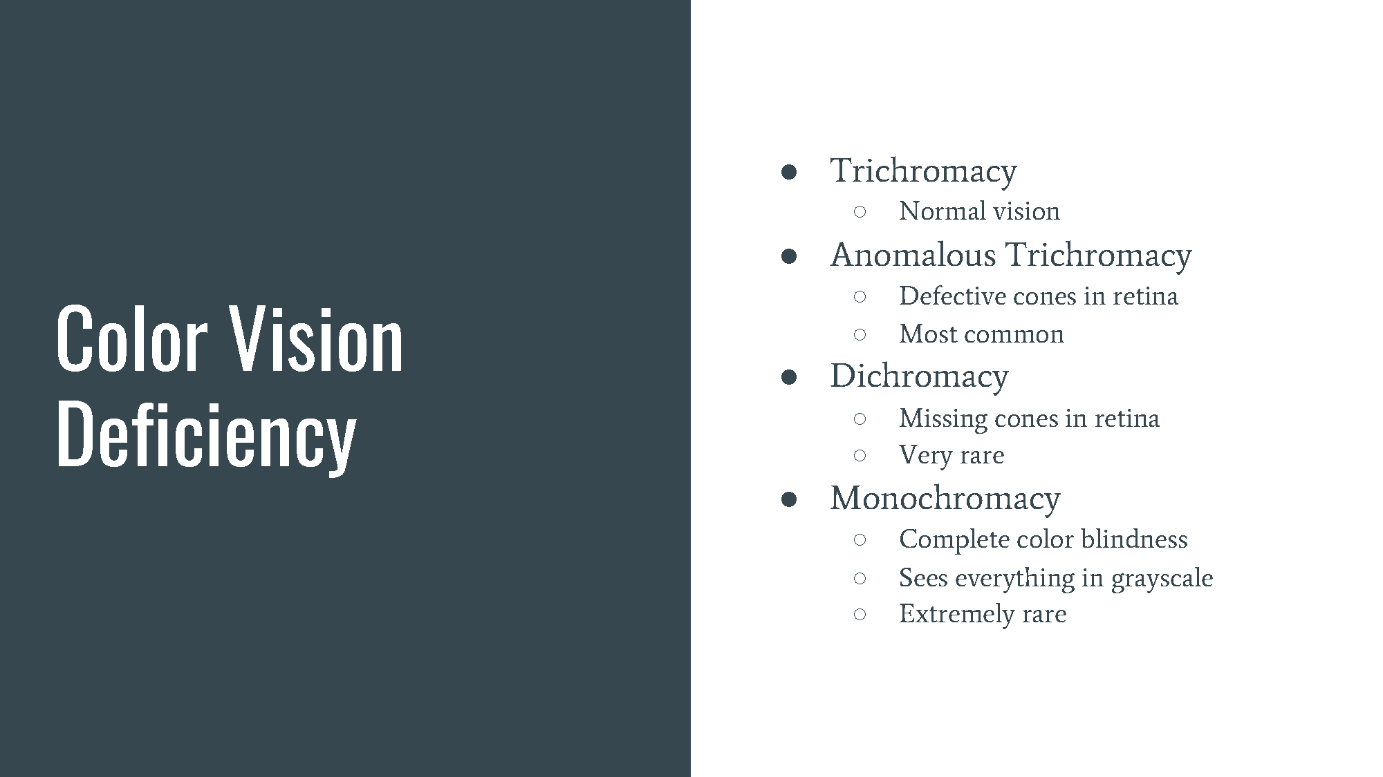
At the back of the human eye is the retina that has two types of light receptor cells; rods that detect light levels and three types of cones that detect green, red, and blue colors [Johnson #]. Color vision deficiency happens when one, two, or all three cones are defective or missing [Jefferson and Harvey #]. Trichromacy is the normal color vision that uses all three types of cones properly. People with normal color vision are called trichromats. People with defective cones are color blind to some extent. They are known as anomalous trichromats. People with missing cones have more severe symptoms of color vision deficiency. They are known as dichromacy.
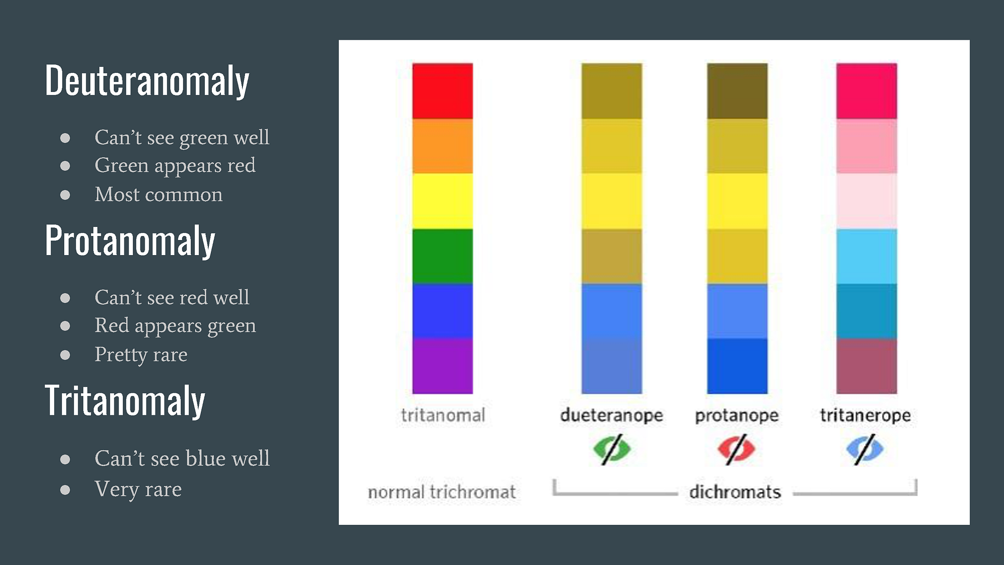
Anomalous trichromats have all three types of cones with one type of cone not working correctly. There are three types of color deficiency with anomalous trichromacy. The most common condition is called deuteranomaly which is a reduced sensitivity to green light, and green tends to be perceived redder. The other condition is protanomaly, the opposite of deuteranomaly, which is a reduced sensitivity to red light and red tends to be perceived greener. Deuteranomaly and protanomaly are common color deficiencies that people know as green/red color blindness. People with these conditions have a difficult time distinguishing green from red and red from green. The third condition is called tritanomaly, which is a reduced sensitivity to blue light and is extremely rare [Chaparro and Chaparro #].
Dichromacy color vision deficiency has two types of cones with the third type of cone missing entirely. People with dichromatic color vision have a difficult time distinguishing colors in general. There are three types of color deficiency with dichromacy. People with the conditions of deuteranopes cannot perceive any green at all and people with the conditions of protanopia cannot perceive any red at all. The differences between the two are more specific and complicated than the ones of anomalous trichromacy. Lastly, people with the conditions of tritanopes cannot see any blue at all [Chaparro and Chaparro #].
Color vision deficiency does not usually mean that one lives in a black and white world. However, there is one condition that’s even rarer than any other color vision deficiency: monochromacy. This extremely severe condition occurs only in approximately 1 in every 33,000 people. People with monochromatic vision only have one type of cone or no cones at all and they suffer total color blindness. Monochromatic vision can only see shades of gray [Colour Blind Awareness].
Secondary Indicators
It’s hard to imagine life without green or red. Despite the common color vision deficiencies around green and red, ironically, those are the most commonly used colors for indicators [Babich], especially for alerts, in the digital world. How would the users with green/red color vision deficiency distinguish the green button from the red button without the secondary indicators such as texts or icons? One of the great agonies for green/red color vision deficiency users is when they fill out forms online. Simply put, green means pass and red means fail in most cases for online forms [Babich]. If the color of the field in a form simply turns red from gray for insufficient information input, the users will not know which field is filled out incorrectly unless it is indicated with secondary elements.
The indicators, especially for forms and CTA buttons, shouldn’t rely on colors alone to convey information. The most common example of this is the red error message. The easiest and most effective approach is to use secondary elements such as texts or icons along with the colors. Icons and symbols are a great way to visually convey the message and make the interface more accessible at a glance. Having text labels in forms improves usability and helps users correct errors quicker. Using an asterisk (*) for the required field is another great way to indicate what’s important without relying solely on colors. Many times, the primary call-to-action buttons are differentiated with a different color. The problem with this is that the color that is used may be difficult for color vision deficiency users to perceive. This problem can be easily addressed with increased button size, different placement of the button, and/or higher contrast between primary and secondary buttons. Secondary elements or cues, in addition to colors, can improve usability and help the interface or product to communicate more effectively with the users [Bingham et al. #].
High/Low Contrast
Vision is optimized for contrast. People with color vision deficiency often rely on contrast in lights to recognize objects [Tuchkov]. A website that uses similarly shaped icons in different colors to indicate different information will be difficult for color vision deficiency users. A digital product that has a foreground component without enough contrast on the edges to the background colors can be challenging for the color vision deficiency users to enjoy the product [Shen et al. #]. Lack of contrast between colors will create unnecessary confusion for these users. This means that even though the colors that are used on a digital product or interface may meet the basic requirements of contrast ratio for normal vision users, the same colors may not have enough contrast for color vision deficiency users, making it difficult for them to access the same message or information [Troiano et al. #].
High contrast between visual components is considered a great way to improve usability for color vision deficiency users. Low contrast between design elements or even texts can be difficult to see. There are many ways to enhance the contrast between colors. Using black or white is not always the ideal solution. Use a range of hues, tints, and tones to have a more pronounced contrast. The brightness and saturation levels can also provide more contrast and help the colors to be easily distinguished by the users with or without color vision deficiency. When designing an interface, it helps to turn off the color to see the final product in grayscale to check the contrast [Tuchkov].
Color Pallettes/Combinations
Many colors have been assigned specific meanings, such as danger or caution, according to color psychology and play a crucial role in interface designs. Color is the most noticeable cue that makes visual search more efficient by capturing users’ attention. Color represents a powerful tool for conveying information and also can help categorize visual clutter by providing order and unity in graphics-heavy interfaces [Chaparro and Chaparro #]. For example, colors on maps are used to represent different types of trails and streets that could otherwise appear like a cluster of lines and shapes. Colors can enhance aesthetics and even induce emotional responses or moods [Chaparro and Chaparro #]. Knowing how to pick which colors for which component is important for effective visual communications. However, there is a lot more that needs to be taken into consideration than simple color psychology and theory when it comes to picking colors for accessibility optimization. It is almost impossible to accommodate all types of color vision deficient conditions but that being said, these are some of the potential nightmare color combinations and palettes to avoid for the majority of color vision deficiency users: green/red, green/blue, green/brown, green/black, green/grey, blue/grey, blue/purple, and light green/yellow.
Most people with color vision deficiency can easily perceive the contrast among graphical elements or within the images, therefore using a combination of light and dark colors can help make the interface more accessible as well. Since color vision deficiency affects people in different ways, it’s difficult to determine which colors are acceptable to use in digital products for accessibility. The more muted the color palette is, the more difficult it will be for users with color vision deficiency to perceive because muted colors tend to have less contrast between them. One way to optimize the interface design for these users is to avoid using any color combinations at all. Instead, keep the color palette with a single color in different shades.
Data Visualizations
In data visualization, colors play a significant role and are used to highlight important information. Colors are an instrumental role in guiding the viewer’s eye from one data to another and illustrating relationships between various types of information. The colors that are used in infographics usually represent the data that each color is assigned to. Charts and graphs, for that reason, can be difficult for users with color vision deficiency to understand — especially if the colors are the main, and only, visual cues. With limited visual indicators, many data visualizations are often very confusing for these users.
Do not rely solely on colors to communicate complex information. Incorporating extra visual elements when presenting data or infographics, instead of using multiple colors, is a great way to add visual emphasis that is easily recognizable by users with color vision deficiency. Simple adjustments to the graphics can significantly improve accessibility. The graphics, that use colors that are difficult to differentiate, can be accompanied by icons or text labels to communicate better. Different patterns and textures can help color deficiency users to easily distinguish between different pieces of information in the data visualization. It is even better if the patterns and textures have high contrast from one another. In addition to patterns and textures, another great way to make the data visualization accessible is to use monochromatic colors. Problematic colors and tricky color combinations can be entirely avoided by simply using monochromatic colors.
Text on Images
As previously stated, vision is optimized for contrast. This is not only true for colors in buttons and graphics but is applied for text and links as well. Better readability comes with higher contrast. Many interfaces nowadays use text over images. Texts over images or any other background are not always ideal for users with color vision deficiency. In many cases, the background image does not have sufficient contrast to visually support the text on it.
Accessibility can be achieved with the combination of background color, text color, and text size [Silver]. Reducing the background opacity increases the contrast, making the text easier to read. Another solution is to stylize the text itself to be more visible — a solid color background or a drop shadow can be added to ensure enough contrast between the text and the background image.
Anchor Text Treatments
If colors are the only visual cue for clickability, it creates an accessibility barrier for users with color vision deficiency. To find the link, these users will have to rely on the hover effect. They will scan with their cursor the entire page waiting for the cursor to change to a pointer indicating clickability. A lot of the time, the anchor text is bolded to indicate that. While it may be possible for users with a color vision deficiency to distinguish bolded anchor text from the rest of the text, it is certainly not ideal due to the low contrast ratio. Some users with severe color vision deficiency conditions, in many cases, cannot differentiate between bolded anchor text and regular text at all. Having to hunt for links distracts the users from achieving the purpose of their visit and ultimately devalues their overall user experience.
Links should be easy to spot even without the color at all times. One way to emphasize anchor text from the rest is to use secondary indicators, such as icons. The anchor text with an icon, as simple as an arrow, is much easier to spot. Another way is to simply add an underline to distinguish anchor text from the rest of the content. Underline is a method that’s used in most cases. This makes it easy for the users to immediately tell the difference between anchor text and regular text and it is possibly the easiest way to address this particular issue.
DESIGN IMPLICATIONS ON ALL TRAILS WEBSITE
Addressing color vision deficiencies is key in providing an appropriate user experience [Troiano et al. #]. There are different ways to improve the current All Trails website to be more accessible and to ultimately increase the usability for users with color vision deficiency. A big portion of this particular digital product relies on maps with overlaying graphic components. The colors that convey meaning and their impact on usability will be closely examined with the assessment of the secondary graphic components and their roles.

One of the features of the All Trails website is the custom map creator. It is a great feature that allows the users to draw their own routes directly on the digital map from one point to the next with optional waypoints to create new hiking trails. This feature uses dots and lines in five different colors that are different hues, but with the same level of tints, tones, and shades. Of the five colors, the two main ones are green and red. On this particular map page, the green/red color vision deficiency users will see two green dots that are actually green and red, two blue dots that are actually blue and purple, and one yellow dot which looks more like a lighter version of green. If the red dots indicate routes that are closed and the green dots indicate clear, the users will have no way of knowing which is which until they get to that spot and see it in person. If the blue line indicates flat trails and the purple line indicates hills, it won’t be easy for these users to separate one from another just by looking at the map.

The map that All Trail uses is generally green with bits of red and yellow. It only makes sense since it is a nature hiking promoting website and most of their maps are of mountains. All their default trails are marked with red lines — a very contrasting color that pops on the generally green map. However, that color combination was majorly shortsighted, given the fact that red and green are the most commonly affected by color vision deficiency. For users with green/red color vision deficiency will have to look very close to follow the green trail, which is actually red, on the already green map.
All Trails uses images or maps to overlay the trail name on some of the pages. This creates a readability issue with users with color vision deficiency. With not enough contrast between the text and the background, these users will have a difficult time reading the trail name at a glance.

There are several ways to resolve the accessibility problems on the All Trails website. One way to optimize the accessible interface design for people with color vision deficiency is to add secondary indicators, such as text labels or icons. Their membership form has a good example of the error indicators for accessibility. The insufficiently inputted information is indicated with a bold field outline and an error message directly under it. Even though this indication is in red, the two secondary elements — the bold outline and the text label — make it clear enough for these users to easily notice which field has an invalid input. For their map pages, the color dots can easily be replaced with icons or symbols, while keeping the colors for normal vision users, to better communicate the assigned roles of each color. To more appropriately serve the users with color vision deficiency, the green and red pairing can be replaced with dark green and light green, green and blue, or something similar that has higher contrast. Different patterns or textures can be added as a secondary visual element for the solid lines that represent the hiking trails while keeping the five colors that they currently have. This same solution can be applied to their charts and graphs showing the member’s stats as well as details of the trails. If having two different sets of graphics using textures and patterns is causing even more confusion, then a single color simply in different shades with enough contrast can be used. The hiking trail names overlaying on top of images can be easily addressed by adding more contrast between the text and the background image. The anchor texts can also accompany an extra element throughout the website. By simply underlining those anchor texts while keeping them green can add a tremendous visual cue for users with color vision deficiency.
CONCLUSION
Visual solutions that are color-dependent may improve the user experience but are not so helpful for everybody. Some visual cues, beyond colors, that can help improve the usability of color vision deficiency users are secondary components — patterns, textures, symbols, text labels, underlines, and contrasts in sizes. A better way to distinguish the different information with icons and other indicators can be suggested with the help of many free assistive tools that are readily available to help improve the interface design for accessibility. Ultimately, the secondary visual cues will help prevent important visual information from disappearing when viewed by color vision deficiency users. The experience of these users must be taken into consideration when creating digital products. Using a color palette acceptable to these users and evaluating which color combinations to use or avoid can also effectively help create accessible and aesthetically pleasing digital products in this digital world.
BIBLIOGRAPHY
Babich, Nick. “Accessibility for Visual Design.” UX Booth, 2017, https://www.uxbooth.com/articles/accessibility-visual-design/.
Bingham, Ryan, et al. “Strategies to Improve Accessibility for Learners with Color Vision Deficiency.” ACM Inroads, 2019, pp. 52–56.
Chaparro, Alex, and Maria Chaparro. “Applications of Color in Design for Color-Deficient Users.” Ergonomics in Design: The Quarterly of Human Factors Applications, 2016, pp. 23–30.
Colour Blind Awareness. “Types of Colour Blindness.” Colour Blindness, https://www.colourblindawareness.org/colour-blindness/.
Jefferson, Luke, and Richard Harvey. “An Interface to Support Color Blind Computer Users.” CHI ’07: Proceedings of the SIGCHI Conference on Human Factors in Computing Systems, 2007, pp. 1535–1538.
Johnson, Jeff. Designing with the Mind in Mind: Simple Guide to Understanding User Interface Design Guidelines. Second Edition ed., Morgan Kaufmann is an imprint of Elsevier, 2014.
Shen, Wuyao, et al. “Seamless Visual Sharing with Color Vision Deficiencies.” ACM Transactions on Graphics, 2016, pp. 70–82.
Silver, Adam. “Improving The Color Accessibility For Color-Blind Users.” Smashing Magazine, 2016, https://www.smashingmagazine.com/2016/06/improving-color-accessibility-for-color-blind-users/.
Troiano, Luigi, et al. “Adapting Palettes to Color Vision Deficiencies by Genetic Algorithm.” GECCO ’08: Proceedings of the 10th annual conference on genetic and evolutionary computation, 2008, pp. 1065–1072.
Tuchkov, Ivan. “Color Blindness: How to Design an Accessible User Interface.” UX Collective, 2018, https://uxdesign.cc/color-blindness-in-user-interfaces-66c27331b858.


